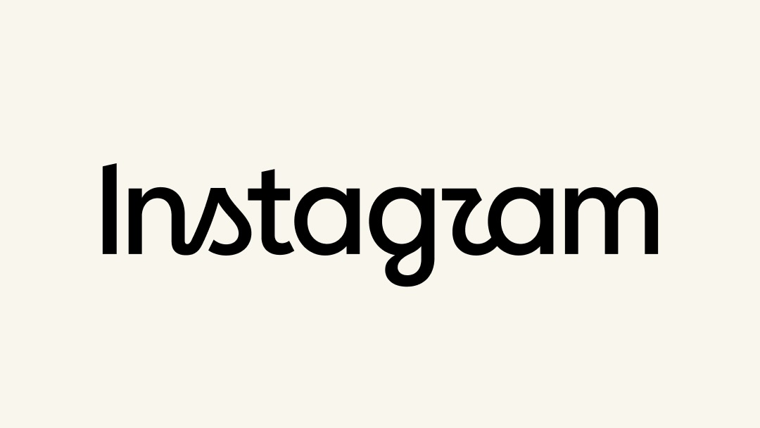
Today, Instagram unveiled a refresh of its wordmark, accompanied by the usual bland corporate platitudes these kinds of announcements are always packaged with.
Head of Instagram Adam Mosseri called it “leaner and more modern, with references to the original and the simplicity and craft that’s always made it Instagram.”
Sure, Adam. Simplicity and craft are definitely what everyone thinks of when Instagram comes to mind.
I might be more inclined to think ruthless algorithmic capture, relentless influencer hype cycles, and don’t forget mining every last gram of your personal data to be packaged and repackaged and sold.
Still, it’s been 10 years since the wordmark was updated, and in the current fruit fly life cycle of frenzied tech rebirths, that’s almost staid. This kind of housekeeping for a brand isn’t something I would normally remark on.
But I had two thoughts when I looked at the new text. The first is the one we probably all had, “Why does it say Instagzam?”
The second was “Huh, it looks just like AI slop!”
I don’t mean I think the design team at Instagram used AI to make the logo. I doubt it, honestly; this is something machines are still terrible at. I mean, it literally looks like the almost-but-not-quite-real words that generative AI often outputs in images—the weird cutoff letters and spacing that come out of the noise.
The ‘s’ is supposed to be a callback to the old logo’s cursive, but it feels like the random number generator grabbed a different typeface. The slightly unsettling kerning around the ‘g.’ But mostly the whole “I am a robot, and I don’t know what an ‘r’ looks like” action.
As a functional piece of text, I don’t think the new wordmark does a great job. It has legibility and identity problems. But as a symbol of our new AI slop era? It might actually be unintentional genius.